By: Ella Mahan
Staff Writer
The “Between the Lines: Typography in LACMA’s Collection” exhibit includes more than thirty posters and publications that showcase how typography is an indispensable component at the heart of visual communication. Typography can be defined as the theory and practice of letter and typeface design. In other words, it is an art concerned with design elements that can be applied to the letters and text on a printed page.
Visitors of this dynamic exhibit are treated to a wide assortment of typographic approaches that range from brash headlines to delicate hand-drawn text. These works as a whole demonstrate how innovative typography can enhance a work of design, adding layers of meaning beyond the simple words on the page. The pieces on display delight and intrigue viewers with the multitude of meanings that can be found within each letter, both literally and figuratively.
Each of the pieces on display are drawn entirely from acquisitions made as part of LACMA’s Graphic Design Initiative. The works span over a half century from the 1950’s to 2013, and feature the work of many influential domestic and international designers including the American married team of Charles and Ray Eames made famous for their contributions to modern architecture and furniture. The innovative designers included in this collection challenge the limitations of available technologies, from letterpress to photo typesetting to computer software.
Throughout the 20th and into the 21st century, typography has been used to elevate and reframe the words on a page, striving to capture while attempting to reflect the pace and mood of their time. Designers who engage in this art form wrestle with how to use letter spacing and form to reinforce the meaning of their text. The labor and passion put into creating the concepts for the art that these words have become shines through each and every piece.
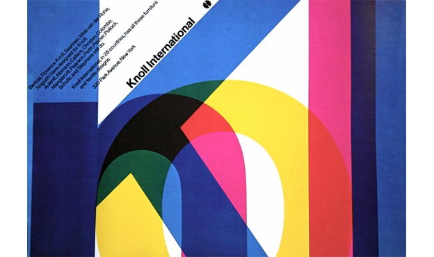
One of the pieces on display is the Offset lithograph made for modernist furniture company, Knoll International in 1967 by Massimo Vignelli. Vignelli was an eager advocate for International Style principles of clarity and order which he conveyed seamlessly in the print. Vignelli is most often associated with the Swiss font Helvetica, as used in this poster. Vignelli also used bold strokes of the three basic colors: yellow, magenta and cyan, ensuring that the overlapping letters maintain legibility. The poster was his first design for the modernist furniture company who remained a client of Vignelli’s for decades. The poster displays the colors beautifully, while also drawing in the viewer to the text on display as it is meant to.
Also shown in the exhibit was ‘The Journal of Typographic Research’ by Jack Werner Stauffacher in 1967. Printer, Stauffacher was commissioned to design a new publication called the ‘The Journal of Typographic Research’. Its unique cover was created by repeatedly moving lines of Univers type before each pass through the press, using traditional printing techniques to create an unconventional image.Like many of his experimental typographic prints, the oscillating lines of text capture the energy and movement of their production.
Also on display was the 1967 screenprint, “Things Go Better With” by Corita Kent, who was an influential artist and educator. Kent appropriated texts from popular culture for her exuberant prints, using innovative typography to encourage deeper readings of banal slogans. This screenprint pairs the famous Coca-Cola jingle with a hand written passage by activist priest Rev. Daniel Berrigan, recasting it as a call for “justice, peace, unity, and love.” Kent uses fluorescent colors and distorted lettering, underlining the radical nature of her simple message.
After taking in the exhibit, viewers can appreciate the work that goes into creating typography. The exhibit is a rare opportunity to see the impact that words can have on people, as well as a way to visualize how delivery is everything when voicing a meaningful message.
“Between the Lines Typography in LACMA’s Collection” is currently open in the Ahmanson Building, level 2 at LACMA. For more information on future exhibits, visit www.lacma.org.

Leave a Reply